
What Is The True Size Of Africa?
Have you ever looked at a map of the world and wondered how big some countries are and how tiny some other countries are? Well, your eyes and the map may have deceived you! Unbelievable isn’t it? have you ever thought why Africa is so small compared to other continents? Have you ever said, “hey look Russia is bigger than Africa!”, “Canada is as nearly big as Africa!” ?? keep reading on, you will see why it seems like that on the map and why really it is not like that.
Feel flabbergasted after what you heard? Don’t be, as the fault is not with you or your eyes but with the “Mercator projection”, the standard blueprint and template used in mapping the world.
So, what is this “Mercator projection”?
Geert de Kremer, better or commonly known as Mercator was a cartographer (a map maker) in Europe around the 16th Century. To make it easier for European explorers to navigate the treacherous oceans, he created a map projection in 1569 which is known today as the Mercator projection.
What Mercator projection did was to make the ocean navigation easier for sailors and ship captains and commanders.
Mercator was initially building globes, or not flat maps but curved Earth-like shaped globes. However, then he decided to make a flat map for naval voyagers which will be easier to use and versatile during their travels.
The problem arose when the map on the globe which was three dimensional, was laid out on a flat surface. Which was two dimensional. He took the equator as the “logical” center of the map but then it left large and ridiculous gaps near the pole regions (North and South Pole).
Mercator, being a creative man, came up with a genius solution for this. What he did was stretching the northern and southern extremities to fill in those gaps near the poles. Eventually, he designed an accurate and effective map for ocean navigators.
However, the vastly beneficial map came at a price. Due to the stretching-out of the polar region, it altered the actual sizes of countries near the North pole and South pole. Moreover, it distorted the proportional sizes of the continents. Still, it was accurate enough and useful for navigators, yet the actual geographical details of the map were misrepresenting.
Common Errors and Myths Surrounding Africa’s Size
“Russia is Bigger than Africa!“
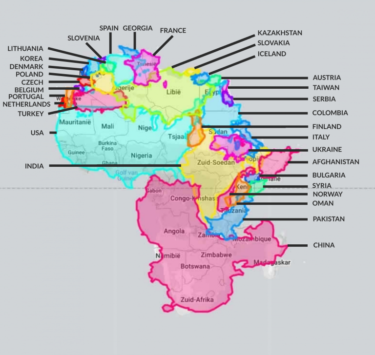
Let’s do this together. Take a map or google one and see which is bigger, Russia or Africa? You’ll clearly see that Russia is bigger right? but in reality, Russia is only 16.4 million square kilometers big and Africa is near twice as much as Russia and an area of 30.2 million square meters.
Africa Is 84% Bigger Than Russia
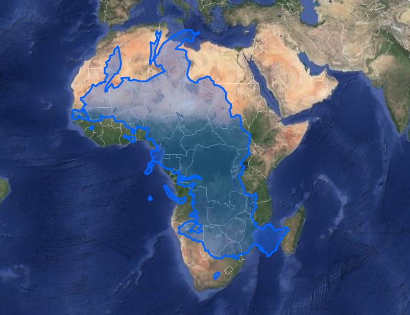
Yet Russia is located extremely near the North pole and Africa is positioned exactly in the Equator and Equator surrounding region. This makes Russia stretch out in maps and Africa not to stretch out as it is near the equator. In the process, the stretched Russia looms much bigger than the entire African continent.
“Greenland is so big it surpasses Africa in Size!“
This too is an optical illusion created by the Mercator projection. Greenland is situated almost entirely in the North Pole which makes it heavily stretched out in the maps, making it look bigger and wider. In fact, Africa is almost 14 times larger than Greenland as it is only 2.16 million square kilometers in size.
Africa Is Almost 14 Times Larger Than Greenland
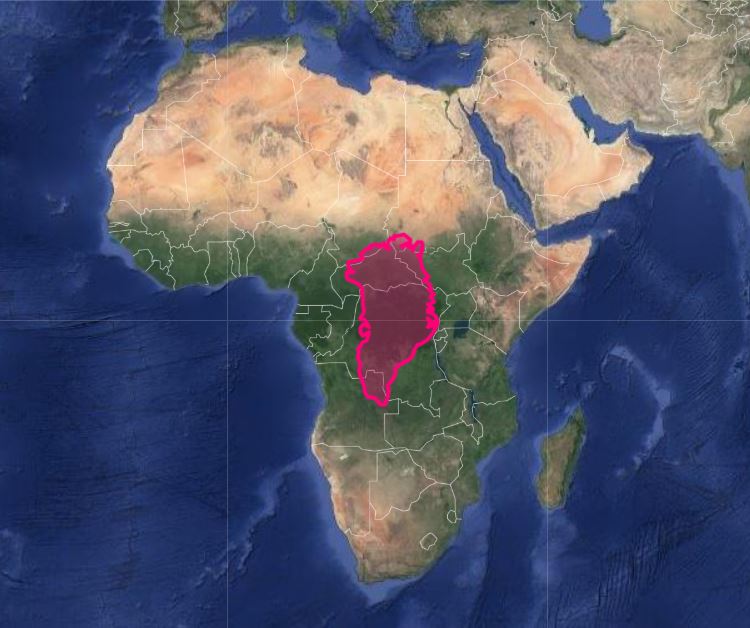
Another fact is that some countries located in the African continent are bigger than Greenland itself, such as the Democratic Republic Congo which covers an area of about 2.22 million square kilometers.
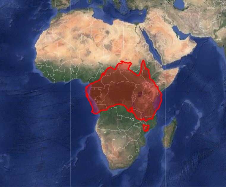
“Australia might be the smallest continent, yet Africa is only a little bit bigger than Australia?“
Wrong, again. Australia is so near the South pole it is as well affected by the Mercator stretch effect. In reality, Africa is nearly 3 times as big as Australia.
Africa 3 Times Bigger Than Australia
Did you know?
Check the map, you might see France is bigger than Egypt. Now check the land size, and now you’ll see Egypt is nearly twice as big as France.
Can anyone make a more accurate map?
Unfortunately, this misrepresentation is not Mercator’s fault. This is an inevitable error that occurs with the shape of our platen Earth. As you know (I hope you know), Earth is not a “Perfect Globe”. It’s more of a potato-shaped one. This complicates any effort to create a “perfect” two-dimensional map of our world.
Because of this, “Mercator projection” is still the most widely used and standardized map in the world. Even digital mapping technologies such as Google Maps, OpenStreetMap and Bing use the Mercator projection as their main mapping template.
0 Comments